About

CI
CI
Ecomarine's corporate identity visually expresses our environmental values and technology-driven manufacturing strength.
A consistent logo system, color palette, and usage rules help us build a trustworthy brand at every touchpoint.
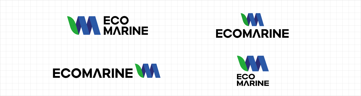
LOGO TYPE
The Ecomarine logotype is designed so Eco's "O" evokes Earth as a garden and Marine's "A" echoes a ship's bow, together expressing a company sailing the oceans for the environment. When the signature alone would be hard to read, use the logotype on its own.
SYMBOL MARK
As the core visual element, the symbol carries the company's spirit and character. It combines a leaf standing for Eco with Marine's "M" (Marine, Material) to represent Ecomarine's work in eco-friendly marine materials.

Symbol & logotype combination
The symbol and logotype may be used separately or together; for each application, legibility and recognition always come first.
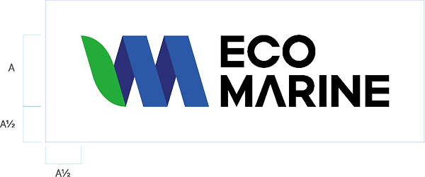
Clear space
These rules set the minimum margin needed to keep the mark easy to read and notice.
Clear space equal to 50% of the symbol's height is required so other visual elements do not crowd the logo.
COLOR SYSTEM
Ecomarine's color system expresses our environmental commitment and technical credibility.
Centered on hues that evoke nature and the sea, it keeps the brand recognizable and consistent.
- C75 / M0 / Y100 / K0
- R34 / G172 / B56
- #22AC38
- P 148-7 C
- C 85 / M65 / Y0 / K0
- R46 / G89 / B167
- #2E59A7
- PANTONE P 104-15 C
- R46 / G89 / B167
- C 95 / M95 / Y25 / K0
- #2A2E77
- PANTONE P 101-7 C
- Headquarters 306, 3F, 60 Dunji-ro, Seo-gu, Daejeon, Republic of Korea
- Research Institute 701, Main Building, Seoul Startup Hub, 21 Baekbeom-ro 31-gil, Mapo-gu, Seoul, Republic of Korea
- Business Registration Number 322-86-02936
- TEL +82-41-582-2542
- FAX +82-50-4244-9484
- E-MAIL ceo@ecomarine.kr

